PLAYSTUDIOS
I worked with PLAYSTUDIOS while at Sprung Studios, a company known for its casino games that reward players with real-world experiences. The goal was to create a tool that would help their partners and improve the efficiency of their internal team's operations.
Problem definition
Partners found the process of creating their experiential offerings to be time-consuming and labour-intensive. There was no centralized platform for measuring performance, managing experiences, or planning events. What was our solution to these problems? A robust application site that included:
- Insights on the application economy and trends
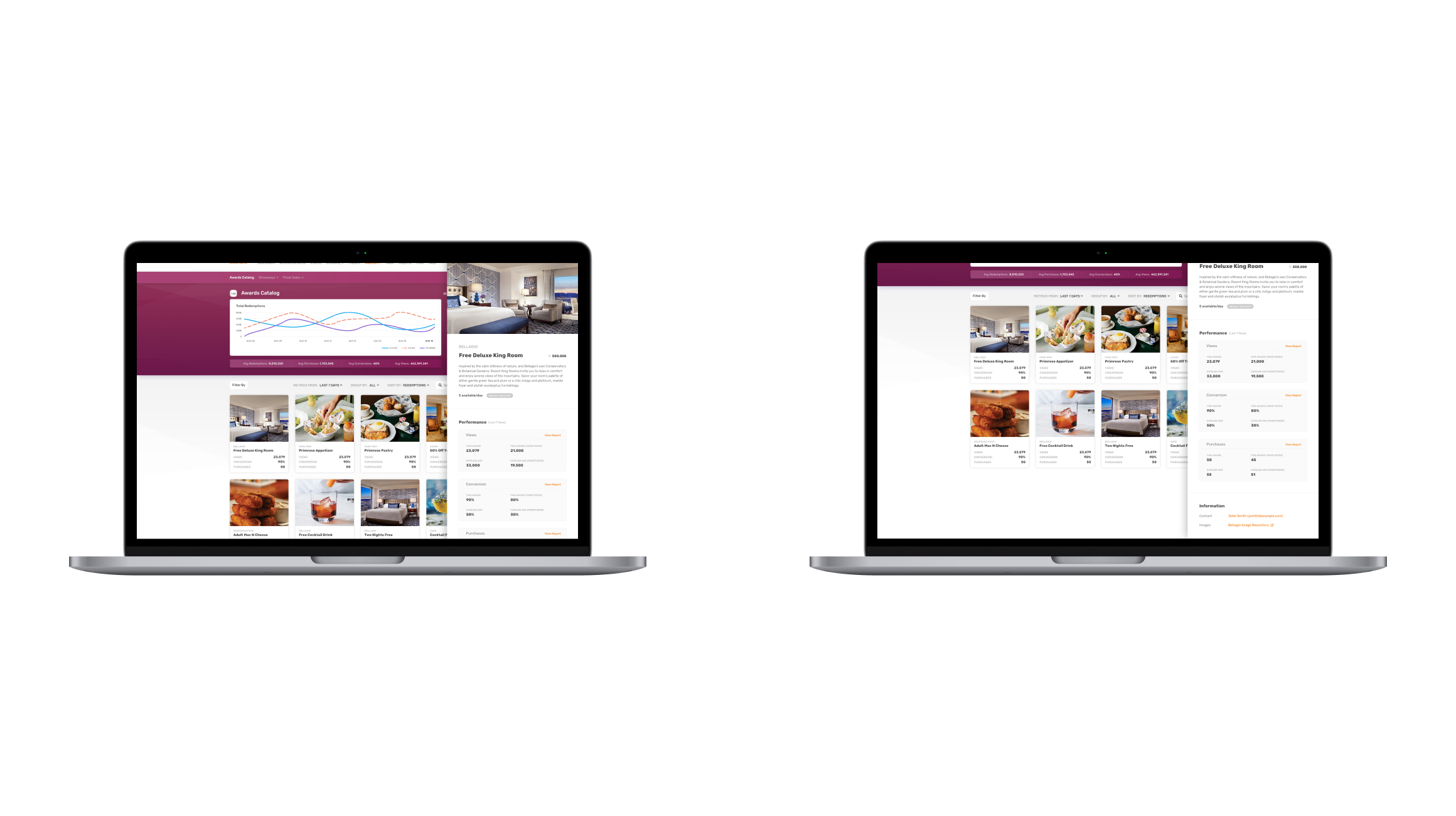
- A broad catalogue of experiences.
- A user-friendly dashboard for task management.
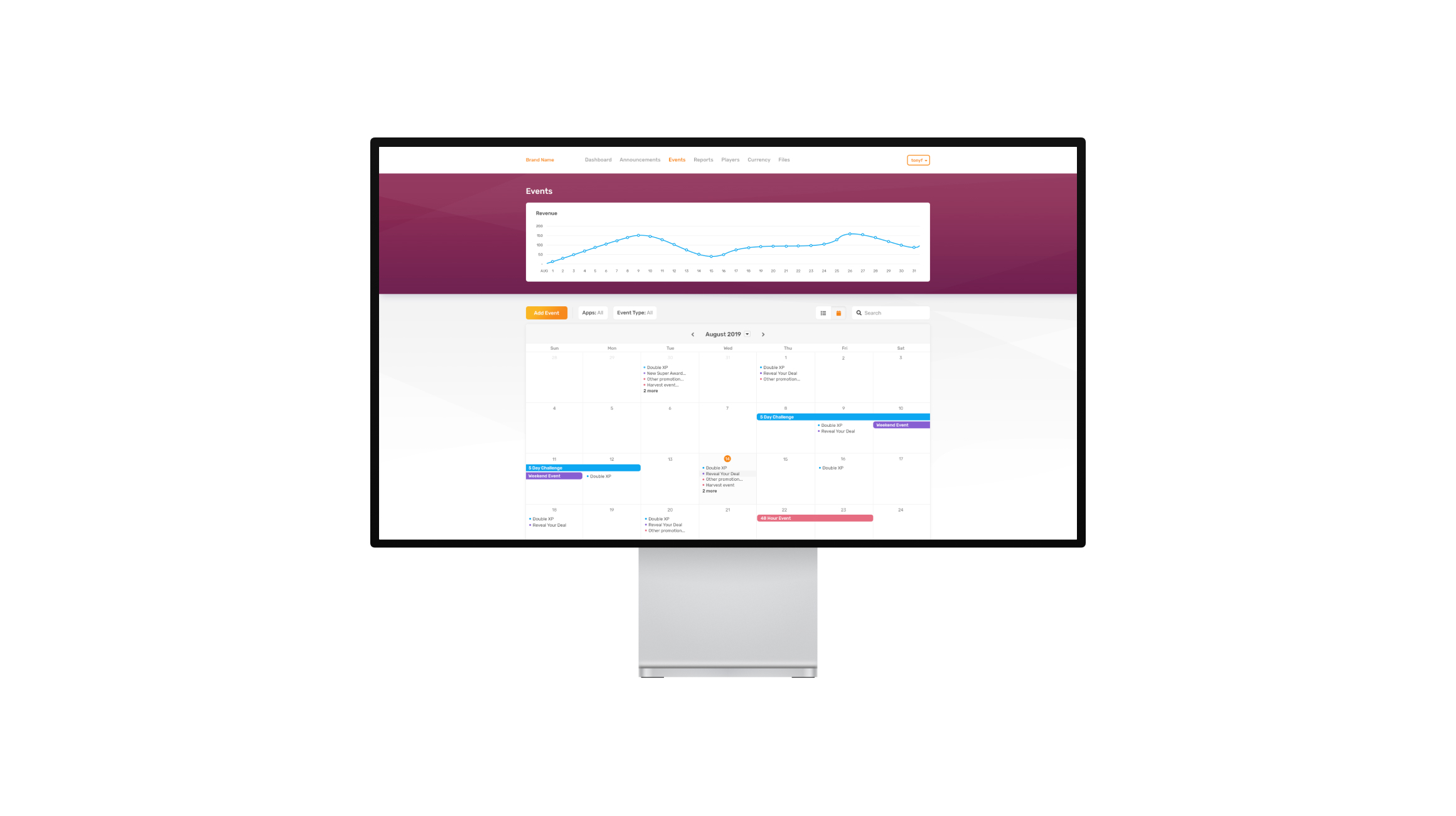
- Event and announcement management tools

User-centric approach
We intended to create a unique, powerful tool that would streamline operations for both partners and the PlayStudios internal staff. It was critical to properly categorize offers so that partners could easily explore and pick the best match. An emphasis was placed on clear and easily available data, particularly economic insights.
User journey mapping
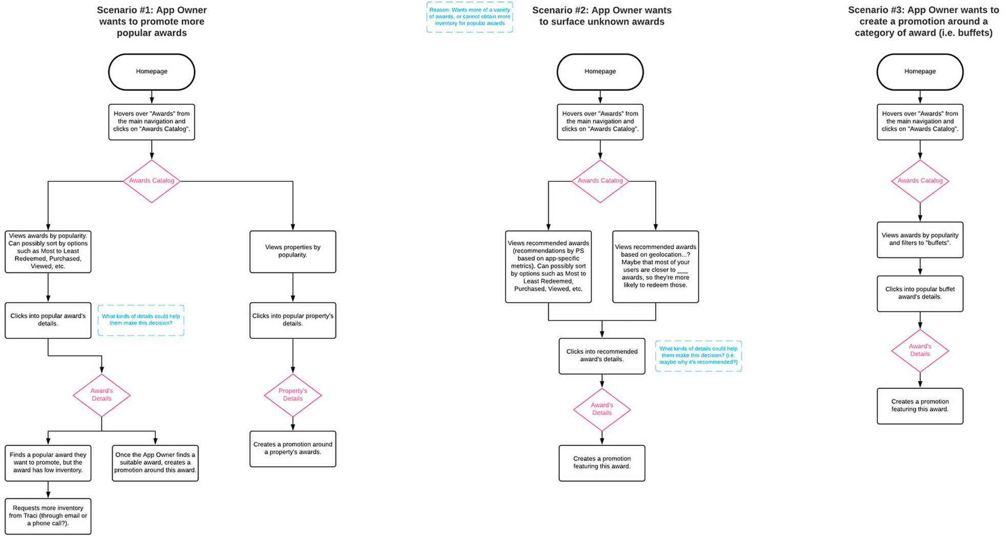
We created unique in-app journeys for potential portal users by researching their goals and roadblocks. Visualizing these routes was critical in creating a smooth app experience for every kind of user.
Design choices
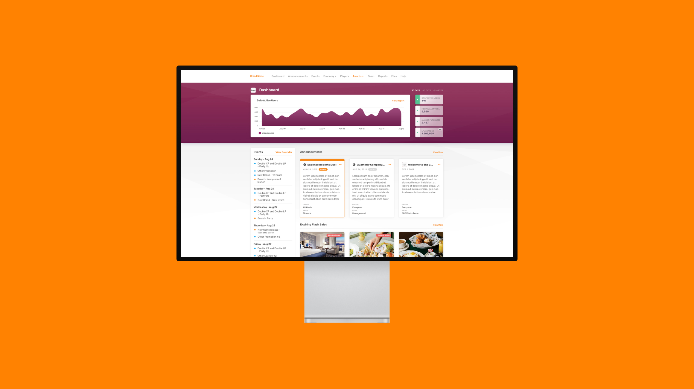
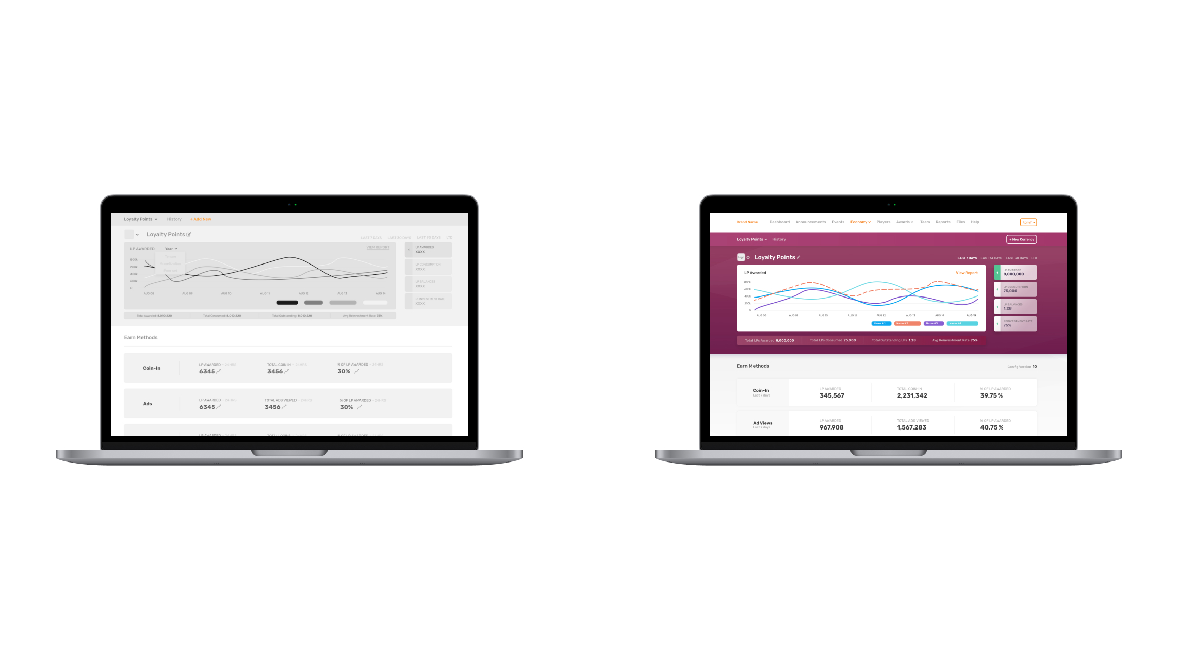
Our designs highlighted critical business metrics with a business insight chart included in the masthead, a feature that was carried over to other metric-centric pages. This strategic positioning ensured that these critical metrics were instantly visible and available to users, improving their experience and understanding of the data. Despite some client reservations, we stuck by our plan to implement a user-friendly calendar. This addition, refined by continuous feedback, addressed a wide range of needs revolving around the management of announcements and events.
Design highlights
The incorporation of business insight charts into mastheads greatly improved the overall user experience. These dynamic visuals provide users with a clear and instant grasp of current business metrics, removing the need for them to hunt through tedious reports. What sets these charts apart is their interactive design. Users aren't just given static data; they're encouraged to interact with it. They can discover new viewpoints and data sets by modifying and engaging with the charts. This seamless integration of data and interactivity offers an informative experience and engaging experience, allowing users to extract maximum value with ease.
Animated transitions across the interface kept users informed of their interactions. These small details have a significant impact on user perception, understanding, and engagement with digital interfaces. They greatly improved the UX by alerting users of the results of their interactions.
- Ease of use: Transitions are smoother with animations. Instead of abrupt shifts, users see a smooth transition from one state to the next, minimizing cognitive load.
- Instant feedback: Click a button and see it animate? This informs users that their action was seen.
- Telling a story: Transitions show users the relation between screen elements. For instance, fading out a deleted item shows that it's gone.
- Directing focus: Animations guide the user's eyes to where they need to look next.
- Hints on usage: Some animations were used to hint at how to use a feature, like a sliding menu suggesting a swipe.
- Fun factor: Playful animations made using the platform more enjoyable.
Our offering
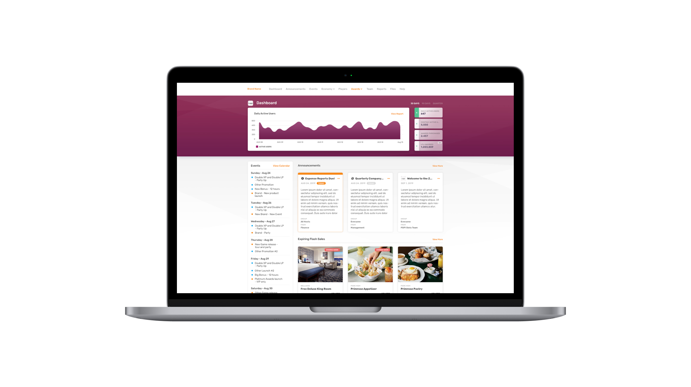
Our efforts resulted in a B2B partner portal that seamlessly connected with PlayStudios' suite of web apps. This portal not only simplified partner tasks, but it also excelled at content management and essential operations. We carefully considered various user access levels, ensuring a comprehensive and user-friendly solution.
We created a portal alongside PlayStudios that has since improved productivity and user happiness by putting their needs first.